
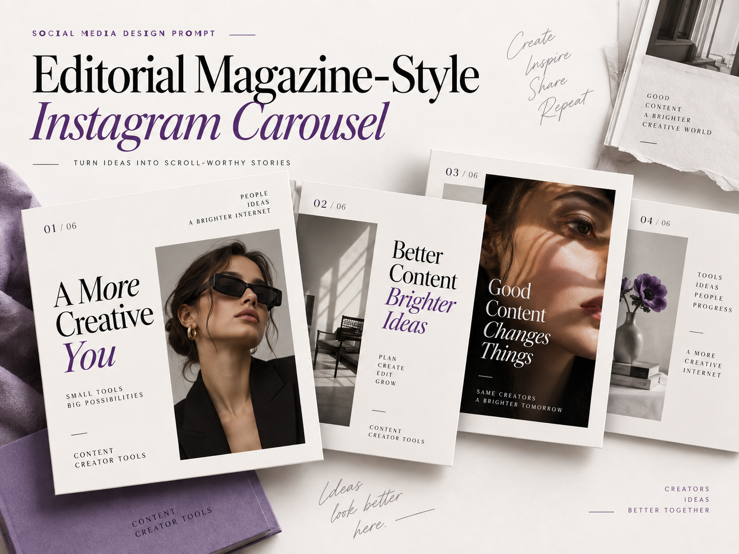
Instagram carousels do not have to look like a stack of presentation slides.
With the right art direction, a carousel can feel more like a magazine spread, using oversized typography, dramatic image crops, intentional negative space, page numbers, pull quotes, and varied layouts that encourage people to keep swiping.
This prompt helps turn ordinary social media content into a polished editorial-style carousel while keeping everything readable and cohesive.
Editorial Magazine-Style Instagram Carousel Prompt
Create a premium editorial magazine-style Instagram carousel based on the content I provide. FORMAT: Design the carousel in a vertical 4:5 Instagram format. Create a cohesive multi-slide visual system where every slide clearly belongs to the same carousel, but avoid using the exact same layout on every page. VISUAL DIRECTION: Use the visual language of a modern fashion, culture, lifestyle, or design magazine. The design should feel polished, sophisticated, contemporary, and intentionally art-directed. Include elements such as: – Bold oversized typography – Strong editorial hierarchy – Clean grid-based layouts – Generous negative space – Dramatic image cropping – Full-bleed photography where appropriate – Small page numbers or slide indicators – Subtle section labels – Pull quotes or highlighted phrases – A mix of typography-led and image-led slides Avoid making the carousel look like a corporate presentation or generic social media template. TYPOGRAPHY: Use a sophisticated editorial typography system. Combine bold headline typography with simple, highly readable supporting text. Headlines should feel confident and visually interesting without sacrificing readability. LAYOUT: Create visual variety throughout the carousel. Suggested structure: Slide 1: Create a strong cover with a striking image and a large headline that immediately communicates the topic. Slide 2: Introduce the subject using a clean editorial composition with supporting text and photography. Slide 3: Highlight one important takeaway using oversized typography or a bold pull quote. Slide 4: Use a split-layout composition combining photography and text. Slide 5: Create an image-led slide with minimal supporting copy. Final Slide: End with a clear call to action and strong visual hierarchy. Do not repeat the exact same composition across every slide. COLOR: Use a restrained color palette based on the subject or brand. Choose one primary accent color and use it consistently throughout the carousel. Keep backgrounds clean and allow photography and typography to carry most of the visual interest. IMAGERY: Photography should feel premium and editorial. Use intentional framing, realistic lighting, natural texture, and confident compositions. Crop images creatively when appropriate rather than always showing the entire subject. READABILITY: All important text must remain easy to read on a mobile screen. Avoid overcrowding slides with too much information. Each slide should communicate one primary idea. CONSISTENCY: Maintain consistent typography, colors, spacing, and visual language throughout the carousel while still allowing each slide to have its own composition. CONTENT TO USE: [PASTE YOUR CAROUSEL CONTENT HERE] BRAND DETAILS: Brand name: [BRAND NAME] Brand colors: [COLORS] Typography or visual style: [STYLE] Primary CTA: [CTA] Generate the carousel as a polished, professional editorial design that feels like a modern magazine adapted for Instagram.
What This Prompt Creates
This prompt creates an Instagram carousel that feels more like a designed publication than a collection of standard social media graphics.
Instead of repeating one template across every slide, the carousel uses visual rhythm. One page might rely on oversized typography, another might feature full-bleed photography, while another uses a clean editorial grid.
The result should still feel consistent, but not repetitive.
This approach works especially well for educational content, personal brands, thought leadership, product storytelling, announcements, and creative portfolios.
How to Use This Prompt
Start by preparing the information you want to turn into a carousel.
You do not necessarily need to write every slide beforehand. You can provide the topic, main ideas, and important points and ask the AI to organize them into a logical sequence.
Replace the placeholders at the bottom of the prompt with your own information.
For example:
Content:
5 mistakes creators make when designing Instagram posts
Brand colors:
Black, off-white, and violet
Style:
Minimal fashion editorial
CTA:
Save this post and follow for more design tips
If you already have final copy for each slide, paste that into the Content section instead.
Make It Your Own
The same prompt can create very different results simply by changing the editorial direction.
Try one of these variations:
Fashion Editorial
Use dramatic photography, strong image crops, elegant typography, high contrast, and confident compositions inspired by contemporary fashion magazines.
Minimal Design Magazine
Use generous white space, structured grids, restrained typography, simple photography, and only one accent color.
Street Culture Magazine
Use bold condensed typography, unconventional image crops, layered compositions, energetic layouts, and slightly imperfect textures.
Luxury Editorial
Use sophisticated serif typography, muted neutral colors, premium photography, generous spacing, and minimal copy.
Tech Magazine
Use modern sans-serif typography, structured modular layouts, clean diagrams, subtle gradients, and precise visual hierarchy.
Tips for Better Results
Give the AI a clear content hierarchy.
Tell it which message should be the main headline, which points are supporting information, and what action you want readers to take at the end.
Avoid putting too much text on one slide. A carousel is easier to read when every page focuses on one idea.
If the result starts looking too much like a presentation deck, reinforce terms such as:
editorial layout, magazine art direction, varied compositions, visual storytelling, dramatic image cropping, intentional negative space
You can also provide a reference image or describe a specific magazine aesthetic you want the design to capture.
Finally, generate a few different versions of the opening slide. The cover has one job: make someone curious enough to swipe.
Final Thought
A good carousel should feel like a sequence rather than a collection of separate graphics.
Typography, photography, and layout create the visual style, but pacing is what keeps people moving from one slide to the next.
Treat each page like part of a story and give the viewer a reason to discover what comes next.
SEO details
SEO Title:
Editorial Magazine Instagram Carousel AI Prompt | Content Creator Tools
Meta Description:
Create a polished editorial magazine-style Instagram carousel with bold typography, premium photography, clean grids, and varied layouts using this ready-to-copy design prompt.
Featured image alt text:
Editorial magazine-style Instagram carousel with bold typography, fashion photography, and clean grid layouts