
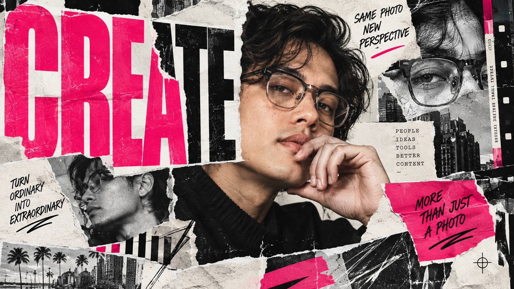
A good portrait does not always need another photoshoot to become an entirely different piece of creative.
This prompt takes a normal photograph and treats it as raw material for an editorial composition, combining the original portrait with oversized type, repeated image fragments, physical paper textures, and controlled graphic chaos.
Magazine Cutout Portrait Prompt
Use the uploaded portrait as the exact visual reference for the person. Transform the portrait into a bold contemporary editorial collage poster inspired by experimental magazine layouts, independent fashion publications, photocopied zines, and modern music posters. SUBJECT: Preserve the person’s recognizable: – Facial features – Face shape – Skin tone – Hairstyle – Ethnicity – Body proportions – Overall identity Do not beautify or significantly alter the person’s appearance. Keep the portrait photographic and realistic while integrating it naturally into the graphic composition. COMPOSITION: Create a vertical editorial poster with the portrait as the dominant focal point. Use an intentionally asymmetrical composition with strong visual hierarchy. Crop portions of the portrait dramatically where appropriate. Allow selected graphic elements and typography to overlap the subject. The composition should feel professionally art-directed rather than randomly layered. TYPOGRAPHY: Add oversized condensed editorial typography as a major visual element. Use a short placeholder headline: [YOUR HEADLINE] The headline may: – Run vertically – Extend beyond the canvas – Sit partially behind the subject – Overlap portions of the portrait Use typography as part of the visual composition rather than simply placing text on top of the image. Add small supporting placeholder text: [SUBHEAD OR DATE] Keep important typography readable. COLLAGE ELEMENTS: Introduce a carefully controlled selection of: – Torn paper edges – Ripped magazine fragments – Duplicated portrait crops – Photocopied facial details – Halftone textures – Film grain – Black ink marks – Handwritten annotations – Registration marks – Thin rules and grids – Tape fragments – Small editorial labels – Abstract geometric shapes Create one or two enlarged fragments of the original portrait, such as: – An eye – Mouth – Hand – Silhouette – Profile – Hair detail Use these as secondary collage elements. PAPER AND PRINT TEXTURE: Make the design feel physically assembled rather than completely digital. Include believable: – Paper fibers – Subtle folds – Imperfect cut edges – Photocopier artifacts – Ink inconsistencies – Print grain – Slightly misaligned layers – Torn edges – Tape or adhesive details Avoid making every element perfectly clean or geometric. COLOR: Use a mostly restrained palette: – Black – White – Warm paper tones – Grayscale photography Introduce ONE dominant accent color: [ACCENT COLOR] Use the accent selectively for: – Typography – Graphic marks – Highlighting – Tape – Small paper elements – Editorial annotations Do not overwhelm the composition with multiple competing colors. DEPTH: Create realistic layering between: – Portrait – Paper – Typography – Graphic elements – Photocopied fragments Some pieces should visibly sit above others. Add subtle paper shadows and dimensional separation while maintaining a graphic, print-inspired appearance. STYLE: Contemporary editorial design. Experimental fashion magazine. Independent culture publication. Photocopied zine. Modern music poster. Premium art direction. Bold typography. Controlled visual chaos. Tactile print texture. The final result should feel suitable for: – Fashion campaigns – Music posters – Creative portfolios – Magazine covers – Cultural events – Personal branding – Social media campaigns IMPORTANT: – Preserve the subject’s identity. – Do not distort facial features. – Do not significantly change the person’s appearance. – Do not generate random gibberish as prominent typography. – Keep the supplied headline readable. – Do not overcrowd every available space. – Maintain intentional negative space. – Keep collage elements visually connected to the original portrait. – Avoid generic scrapbook aesthetics. – Avoid childish stickers or decorative clip art. – Keep textures believable and physically inspired. – The finished design should feel professionally art-directed. OPTIONAL CREATIVE DIRECTION: Headline: [YOUR HEADLINE] Subhead: [OPTIONAL] Accent color: [RED / BLUE / PINK / ORANGE / GREEN / ETC.] Editorial mood: [FASHION / MUSIC / BRUTALIST / LUXURY / STREET / ARTISTIC] Texture level: [MINIMAL / MODERATE / HEAVY] Typography style: [CONDENSED / SERIF / BRUTALIST / EXPERIMENTAL] Poster format: [PORTRAIT / SQUARE / LANDSCAPE]
What This Prompt Creates
The result is a finished editorial-style poster rather than a portrait with a filter applied to it.
The AI uses the uploaded photograph to create multiple visual layers while keeping the subject recognizable. Typography becomes part of the image, portions of the portrait can be duplicated or enlarged, and simulated print imperfections make the finished design feel physically assembled.
It works especially well for fashion, music, creator branding, events, portfolio pieces, and social campaigns.
How to Use It
Upload a clear portrait with enough resolution for the AI to understand the face and important details.
Paste the full prompt, then customize the optional fields at the bottom. At minimum, change the headline, accent color, and editorial mood.
For example:
Headline: BREAK THE FORMAT
Accent color: Electric blue
Editorial mood: Street / artistic
Texture level: Heavy
Poster format: Portrait
The structure stays the same while those few variables can produce dramatically different creative directions.
Make It Your Own
Fashion Editorial: Use a monochrome portrait, deep red accent, elegant condensed typography, minimal tearing, and restrained print texture.
Indie Music Poster: Increase photocopy artifacts, duplicated facial fragments, handwritten marks, rough paper, and aggressive oversized typography.
Personal Brand Poster: Use the person’s name as the main headline with a signature brand color and cleaner negative space.
Brutalist Event Poster: Introduce rigid grids, enormous black typography, registration marks, stark image cropping, and minimal color.
Y2K Magazine Collage: Add chrome-inspired graphic details, bright accent color, tighter image crops, scanner textures, and slightly more chaotic layering.
Tips for Better Results
Start with a portrait where the face is clearly visible. Extreme shadows or heavily obstructed faces give the model less reliable information to preserve.
Keep the main headline short. Two to four words usually produce a much stronger visual element than a complete sentence.
Specify only one dominant accent color initially. You can always introduce additional colors later, but restricting the first generation usually creates a more cohesive composition.
If the first result becomes too busy, add: “Reduce the number of collage elements by 40% and introduce more intentional negative space.”
If the AI changes the person too much, reinforce: “Treat the uploaded portrait as immutable identity reference. Preserve the original face rather than regenerating or reinterpretating it.”
For professional work, consider generating the visual composition without mission-critical small text and rebuilding the final typography manually in Photoshop, Illustrator, or Canva. Image models are much better at art direction than they are at behaving like meticulous typesetters. Tiny type remains their favorite place to invent an alien language.