
Receipts normally have a very short life. We collect them, crumple them, and throw them away. But that familiar strip of thermal paper has everything a visual designer needs: a graphic edge, a continuous shape, and a recognizable printed texture.
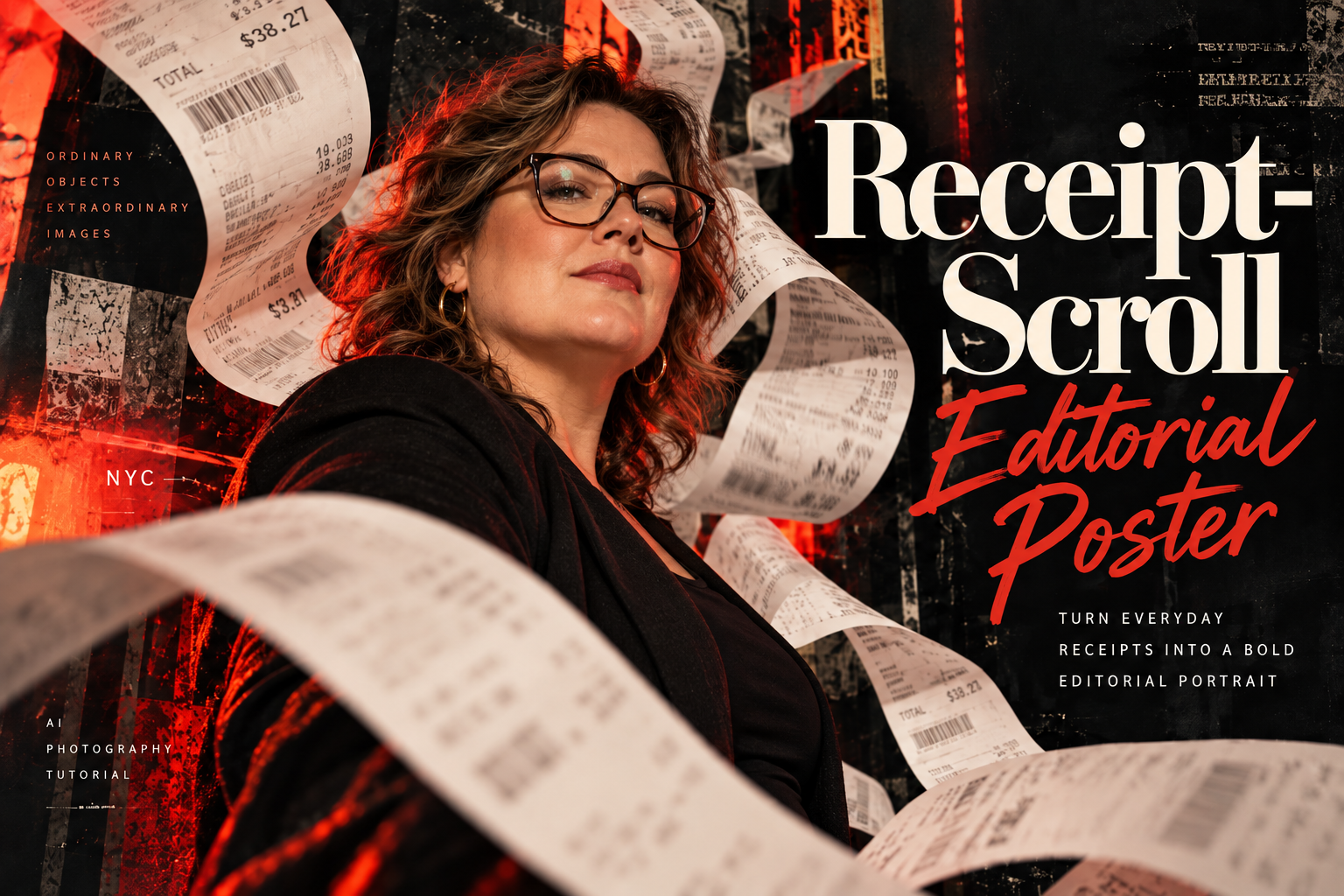
Receipt-Scroll Editorial Poster turns this ordinary material into a dramatic portrait composition. Giant paper strips bend, twist, and move across the scene while a real person anchors the image. The effect is half magazine cover, half experimental printed zine—and far more personal than another perfectly polished fashion advertisement.
Receipt-Scroll Editorial Poster Prompt
Use the uploaded portrait reference, if provided, to create a premium, photorealistic editorial poster called “Receipt-Scroll Editorial Poster”. Make ordinary thermal-paper receipts become huge, sculptural ribbons swirling around the subject within a bold, art-directed fashion-magazine composition. SUBJECT: [UPLOADED REFERENCE PHOTO OR SUBJECT DESCRIPTION]. If no reference is provided, use an ordinary-looking white woman around 40 years old with a naturally plus-size figure, tortoiseshell prescription glasses, shoulder-length softly wavy brown hair, realistic skin texture, and an approachable, self-assured expression. She wears a simple black top or jacket, not glamorous runway styling. When using a reference image, prioritize that person’s real facial identity, eyewear, age appearance, body proportions, and natural features over the example subject; do not slim, beautify, or change their identity. WARDROBE: [USER-SUPPLIED OUTFIT OR SIMPLE DARK EVERYDAY CLOTHING]. POSTER PALETTE: [INK BLACK / WARM CREAM / INTENSE CRIMSON RED, OR USER COLORS]. HEADLINE: [EXACT APPROVED HEADLINE, DEFAULT “Receipt-Scroll”]. SECONDARY TITLE: [EXACT APPROVED SECONDARY TITLE, DEFAULT “Editorial Poster”]. OPTIONAL SMALL COPY: [EXACT APPROVED COPY OR NONE]. FORMAT: [WIDE BLOG HERO / VERTICAL 1080×1440 SOCIAL POST / OTHER]. Create a dramatic editorial portrait with the subject on the left half or left two-thirds of the composition, posed naturally and looking confidently toward or slightly past the camera. Capture her with a realistic 35mm–50mm photographic perspective, believable shoulders and hands, natural skin texture, subtle lens detail, and genuine eyeglass reflections. No unrealistic retouching. Surround the subject with multiple continuous strips of realistic thermal receipt paper, enlarged to exaggerated editorial scale and curling in long S-shaped waves. Some ribbons pass close to the camera and become softly out of focus; others move behind the shoulders and head; one or two sweep through the middle distance. Each strip has thin paper thickness, imperfect curled edges, small creases, slight translucency, believable bend memory, printed barcode-like marks and faint, mostly illegible receipt texture. Never invent recognizable store names, transactions, totals, dates, prices, or customer data; where unapproved text would appear, render it as abstract unreadable printing. Use a tactile black distressed collage background with restrained rough photocopy textures, torn-paper fragments, scratched ink, charcoal-black areas, and bold crimson accents. Add a strong red backlight or red-toned reflected light behind the subject while keeping the face naturally exposed. Emphasize dramatic realistic layering and occlusion; the ribbons must feel like physical paper moving through the same three-dimensional set as the person, not flat stickers or random decorative squiggles. Create sophisticated typography on a spacious dark area to the right: large elegant high-contrast cream editorial serif for the main headline “Receipt-Scroll” (or exact supplied headline) and expressive vivid-red brush-script or bold hand-lettered secondary title “Editorial Poster” (or exact supplied title). Keep hierarchy intentional and readable, with generous margins and a few small editorial microtype details only when exact text is supplied. Maintain enough contrast and clear space so ribbons never obscure the main headline or the subject’s face. For exact professional spelling, leave clean type zones for manual typesetting rather than making up copy. The finished result is a dramatic contemporary magazine cover meets underground printed-zine poster: natural, relatable subject; energetic real-world paper movement; luxurious editorial type; black and red graphic tension; tactile photographic realism. No sexy model tropes, no age-reversing beauty retouching, no invented receipt data, no product hero, no irrelevant props, no watermarks, no repeated faces, and no malformed hands or glasses. The photograph and the graphic design must feel like one compelling, intentionally art-directed poster.
What This Prompt Creates
A portrait-led editorial poster in which giant receipts operate as sculptural shapes, framing devices, foreground depth, and recognizable texture. The subject appears behind, between, and in front of the paper ribbons. Distressed ink-black layers and crimson highlights build energy, while large serif and expressive script typography bring the entire composition together.
The provided example uses an average-looking, plus-size woman around 40 wearing glasses, intentionally moving away from the default young fashion-model aesthetic. You can use your own portrait instead. The design should preserve the person’s natural identity, eyewear, and body proportions while changing the art direction around them.
How to Use It
Start with a good portrait reference if you want a specific person in the image. A clearly visible face and a relatively simple outfit will give the model enough information to preserve features. State explicitly that the hairstyle, glasses, facial proportions, and body shape should remain recognizable.
Next, choose whether you want a wide website hero or a vertical social-media poster. Place the subject to the left and leave intentional negative space for the typography. This prevents the paper ribbons and the headline from fighting for attention.
Keep the receipt strips physical. Ask for thin curled thermal paper, authentic bends, shadows, and overlapping layers. Some ribbons should be behind the model while at least one sweeps close to the lens. The slight depth-of-field softness in the foreground is part of what gives the artwork a real photographic feel.
Finally, define your exact headline and supporting copy. Use AI for the photographic set and overall layout, but review the lettering before publishing. If you need pixel-perfect typography, generate with reserved dark text areas and place the final text in your design application.
Make It Your Own
Xerox Zine: Convert the portrait into a high-contrast black-and-white photocopied aesthetic, with crushed blacks, ink flecks, crooked receipt ribbons, and newspaper-like typography.
Crimson Noir: Keep a mostly black backdrop, deep red rim light, warm cream paper, and dramatic glossy lighting for the boldest editorial variation.
Pastel Retail: Use soft lilac or pale blue lighting with powder-colored set pieces and pristine white paper for a playful version of the same concept.
Checkout Glow: Stage the portrait near a store counter, using warm fluorescent practical light and real paper shadows while keeping the poster layout uncluttered.
Grunge Magazine: Build thicker torn-paper layers, ink stamps, and oversized asymmetric type for a more tactile underground publishing aesthetic.
Tips for Better Results
Keep the subject human. Preserve age, natural body shape, freckles, skin texture, eyeglasses, and recognizable facial features. The graphic style can be dramatic without converting the person into a supermodel.
Build visual depth using at least three paper layers: foreground ribbons, midground strips across the shoulders, and additional curled paper behind the person. Avoid placing receipts directly over the eyes.
Use a limited palette, especially when combining intense color with complicated receipt texture. Black, warm cream, and crimson red help the typography remain readable.
Receipt text can easily turn into accidental fabricated information. Specify abstract, faint, illegible thermal-print marks unless you’ve provided approved numbers and labels. For a publishable design, add your own receipt details afterward if they matter.
Keep the main headline away from curling paper. Large display type should sit in a clear zone; the subject and receipts supply more than enough visual complexity.
Ask for real paper physics: thin edges, curl memory, contact shadows, gentle creases, and consistent perspective. Floating strips are fine as an art-directed moment, but they should look photographable, not like digital stickers.