
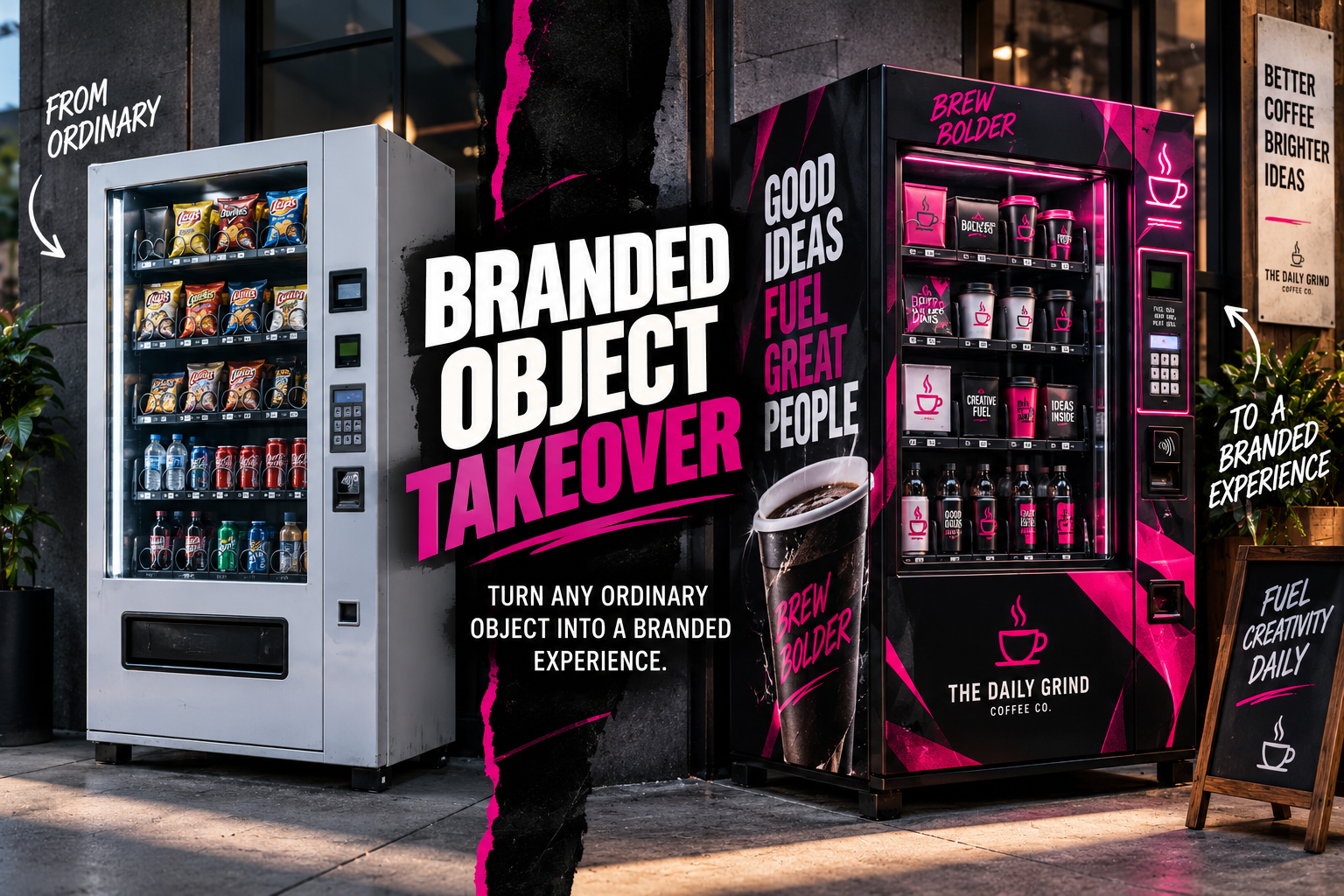
Putting a logo on an object is easy. Making that object feel like it genuinely belongs to a brand is a different challenge.
This prompt takes an ordinary photographed object and treats it as part of a complete visual identity. Instead of simply placing a logo on top, the AI considers the object’s panels, curves, materials, controls, surroundings, and even supporting packaging to create a believable branded experience.
Branded Object Takeover Prompt
Use the uploaded image as the exact visual reference for the main object. Transform the ordinary object into a professionally art-directed branded installation while preserving its recognizable physical construction. The finished image should look like the object was physically redesigned and photographed for a real branding campaign, not like graphics were digitally pasted over a photograph. OBJECT PRESERVATION: Preserve the object’s recognizable: – Shape – Proportions – Dimensions – Construction – Functional components – Openings – Handles – Controls – Doors – Buttons – Screens – Structural panels – Perspective Do not replace the object with a completely different design. The original object should remain immediately recognizable after the transformation. BRAND IDENTITY: Apply the following brand identity: Brand name: [BRAND NAME] Logo: [UPLOAD LOGO OR DESCRIBE SIMPLE LOGO] Tagline: [TAGLINE] Primary color: [PRIMARY COLOR] Secondary color: [SECONDARY COLOR] Accent color: [ACCENT COLOR] Brand personality: [BOLD / PLAYFUL / PREMIUM / RETRO / FUTURISTIC / MINIMAL / ETC.] Create one cohesive visual language based on these elements. Do not simply place a large logo in the middle of the object. SURFACE DESIGN: Study the natural physical divisions of the object. Use its: – Panels – Edges – Curves – Seams – Doors – Handles – Frames – Screens – Controls – Openings – Structural details to determine where branding should appear. Create an intentional combination of: – Color blocking – Logo placement – Typography – Patterns – Stripes – Graphic shapes – Labels – Identification marks – Branded icons – Surface finishes Graphics must follow the perspective and curvature of the physical object. Do not allow artwork to float above the surface or pass unrealistically through seams, openings, buttons, or controls. LOGO: Use the supplied logo accurately whenever possible. Place the main logo in one strong and intentional location. Smaller secondary applications may appear where appropriate. Do not repeat the logo across every available surface. Maintain proper spacing and visual contrast around the logo. If the uploaded logo contains typography, preserve its recognizable appearance. TYPOGRAPHY: Use the following main message: [HEADLINE OR TAGLINE] Typography should feel integrated into the brand system. Use short, readable copy. Typography may appear on: – Main panels – Header sections – Side surfaces – Product packaging – Supporting signage Avoid filling the design with unnecessary small text. Do not generate random gibberish as prominent branding. MATERIALS: Make all branding interact realistically with the object’s existing materials. Examples: Paint should behave like real paint. Vinyl graphics should conform naturally to curved surfaces and panel edges. Printed paper should have believable thickness. Illuminated graphics should cast realistic light. Metallic finishes should reflect their surroundings. Embossed logos should respond correctly to directional lighting. Glossy surfaces should produce believable highlights. Matte surfaces should remain appropriately subdued. Do not make every surface appear like flat digital artwork. BRANDED PRODUCTS OR PACKAGING: If products are naturally associated with the object, introduce matching branded products or packaging. For example: A vending machine may contain branded bottles, cans, boxes, or cups. A coffee cart may include branded cups and bags. A display kiosk may contain matching merchandise. Maintain consistent: – Colors – Logo placement – Typography – Patterns – Materials – Graphic language Keep these elements secondary to the hero object. ENVIRONMENTAL BRANDING: Extend a SMALL amount of the visual identity into the surrounding environment. Possible elements include: – Floor graphics – Wall signage – Posters – Shopping bags – Packaging – Display stands – Directional graphics – Small props – Branded lighting – Menu boards – Wayfinding elements The environment should help sell the idea of a real-world branded experience. Do not cover the entire environment with logos. LIGHTING: Use polished professional commercial photography lighting. Maintain believable interaction between: – Object – Branding – Environment – Reflections – Shadows – Illuminated elements Use controlled highlights and strong material definition. The scene should look physically photographed after the branding was installed. CAMERA: Professional commercial photography. Use: – Natural perspective – Realistic lens behavior – High material detail – Clean exposure – Sharp hero object – Realistic depth of field – Subtle photographic texture Avoid exaggerated wide-angle distortion unless specifically requested. COMPOSITION: Make the branded object the obvious visual hero. Use intentional negative space. Keep environmental brand elements secondary. The final image should feel suitable for: – Branding case studies – Campaign presentations – Creative pitches – Social media reveals – Portfolio projects – Experiential marketing concepts – Brand activation proposals STYLE: Professional brand identity. Commercial art direction. Experiential design. Environmental branding. Premium campaign photography. Cohesive visual system. Photorealistic materials. IMPORTANT: – Do not redesign the object’s fundamental structure. – Do not distort the uploaded logo. – Do not introduce unrelated brand colors. – Do not cover every available surface with graphics. – Do not create prominent gibberish text. – Do not make the branding look digitally pasted onto the image. – Respect physical edges, seams, curves, openings, and controls. – Keep the object’s functionality believable. – Keep the result photorealistic. – Branding should feel strategic rather than decorative. OPTIONAL CREATIVE DIRECTION: Brand name: [YOUR BRAND] Tagline: [YOUR TAGLINE] Primary color: [COLOR] Secondary color: [COLOR] Accent color: [COLOR] Brand personality: [BOLD / PLAYFUL / PREMIUM / RETRO / FUTURISTIC / MINIMAL] Surface finish: [MATTE / GLOSS / METALLIC / CHROME / PAINTED / VINYL] Environment: [STUDIO / STORE / STREET / EVENT / OFFICE / MALL / ETC.] Campaign mood: [CLEAN / ENERGETIC / LUXURIOUS / YOUTHFUL / EXPERIMENTAL] Supporting branded items: [OPTIONAL] Aspect ratio: [4:5 / 4:3 / 16:9 / 1:1]
What This Prompt Creates
This prompt turns an everyday object into something that feels like it belongs inside a real brand campaign.
The AI keeps the object’s original construction recognizable, then develops the branding around its physical characteristics. Panels become opportunities for color blocking, structural edges influence graphic placement, materials determine how finishes behave, and surrounding objects help extend the identity into the environment.
The result can look less like a mockup and more like an actual branded installation photographed after production.
How to Use It
Start by uploading a clear photograph of the object you want to transform.
Objects with visible surfaces and recognizable construction usually work best. Vending machines, coffee carts, vehicles, refrigerators, kiosks, arcade machines, shipping containers, retail displays, lockers, and booths are especially good candidates.
Then customize the branding variables.
For the vending machine example:
Brand name: The Daily Grind
Tagline: Brew Bolder
Primary color: Black
Secondary color: Hot pink
Accent color: White
Brand personality: Bold, energetic, creative
Surface finish: Matte black with glossy vinyl graphics
Environment: Urban café entrance
Supporting branded items: Coffee cups and packaged drinks
Aspect ratio: 4:3
If you already have a real logo, upload it alongside the object and tell the AI to treat it as the exact visual reference.
Make It Your Own
Branded Coffee Cart
Turn a basic coffee cart into a complete mobile café identity with custom cups, menu panels, awning graphics, packaging, uniforms, and restrained environmental signage.
Fashion Vending Machine
Transform an ordinary vending machine into a premium streetwear activation using chrome, monochrome graphics, limited logo placement, dramatic lighting, and branded merchandise.
Branded Delivery Van
Apply a complete visual identity across a delivery vehicle using the natural doors and body panels to guide logo placement, typography, color blocking, and graphic patterns.
Retro Arcade Takeover
Rebrand an arcade cabinet with illuminated signage, custom control graphics, side-panel artwork, branded screen elements, and matching environmental details.
Pop-Up Shipping Container
Turn a standard shipping container into a temporary retail space with exterior graphics, signage, lighting, merchandise displays, and coordinated wayfinding.
Tips for Better Results
Choose a source image where the object’s important surfaces are clearly visible. If major areas are hidden, the AI has to invent more of the object’s construction.
Keep your initial identity simple. Two main colors, one accent color, a logo, and one short tagline are usually enough to establish a strong visual system.
If the output looks like a logo was simply pasted onto the object, add:
“Rework the branding as a physically integrated installation. Use the object’s panels, seams, curves, materials, and structural divisions to determine where graphics appear.”
If the design becomes too busy, add:
“Reduce the amount of branding by approximately 30%. Use stronger negative space and allow more of the original object material to remain visible.”
For important logos and typography, providing the actual logo as a visual reference will usually produce better results than describing it with text alone.
You can also repeat the same brand specifications across several objects. A vending machine, vehicle, storefront, packaging system, and merchandise display using the same identity can quickly become a full speculative branding case study.
Why This Works for Branding
Strong branding is rarely just a logo.
It is the relationship between color, typography, materials, photography, packaging, environment, and repeated visual decisions.
By forcing the AI to think about the physical construction of the object first, this prompt creates branding that feels more intentional and believable.
That makes the result useful not only as an AI experiment, but also as a starting point for concept presentations, mood boards, pitch decks, and portfolio work.
Final Thought
Almost anything can become a brand touchpoint.
A vending machine, coffee cart, delivery vehicle, refrigerator, kiosk, or shipping container can become part of a larger visual identity when the branding responds to the object instead of simply sitting on top of it.
Start with something ordinary.
Then make it unmistakably yours.