
Intro
A good brand identity isn’t just a logo. The real test is whether the same visual idea can survive a business card, package, sign, social post, and product without feeling like five different brands.
This prompt asks AI to build a system first and then demonstrate that system across multiple applications. The result works especially well for early concept exploration, client mood boards, fictional portfolio projects, and quickly testing a new visual direction before producing every mockup manually.
Modular Brand Identity Board Prompt
Create a premium brand identity presentation for a fictional brand called “[BRAND NAME]”, a [TYPE OF BUSINESS]. Develop one cohesive visual identity rather than a collection of unrelated mockups. Begin with a clear creative direction: [3–5 BRAND PERSONALITY WORDS]. Build the identity around a distinctive primary logo and a simplified secondary mark or monogram. The logo system should feel intentional, memorable, professionally art-directed, and appropriate for the business. Create a tightly controlled color palette using [PRIMARY COLOR], [SECONDARY COLOR], [ACCENT COLOR], and a neutral supporting tone. Establish a typography system with one expressive display typeface for headlines and one highly legible supporting typeface for body copy and functional information. Present the identity as a carefully arranged physical brand board photographed from a slightly elevated or overhead perspective. Include: – primary logo – secondary logo or monogram – typography specimen – primary and secondary color swatches – business card or stationery – one branded packaging item appropriate to the business – one small merchandise or promotional item – one digital application shown on a phone or tablet Apply the same visual rules consistently across every object. Logos, colors, typography, graphic shapes, spacing, and image treatment should clearly belong to the same brand. Arrange the objects naturally across a [BACKGROUND MATERIAL / COLOR] surface with thoughtful spacing and subtle overlap. Use realistic materials, printing textures, paper edges, embossing, ink, fabric, plastic, glass, or metal wherever appropriate. Lighting should resemble premium commercial brand photography: large soft studio light, believable contact shadows, controlled reflections, realistic dimensionality, and crisp detail. Composition should feel curated but not perfectly symmetrical. Leave intentional negative space and create a clear visual hierarchy, with the primary logo application acting as the focal point. Style: contemporary brand identity case study, professional creative-agency presentation, sophisticated art direction, tactile materials, realistic product photography, polished but believable. Avoid random mockups, inconsistent logo variations, excessive decorative elements, repeated objects, unreadable micro-text, mismatched colors, generic corporate branding, floating objects, unrealistic materials, and clutter. High-resolution editorial presentation, realistic photography, professional branding portfolio quality.
What This Prompt Creates
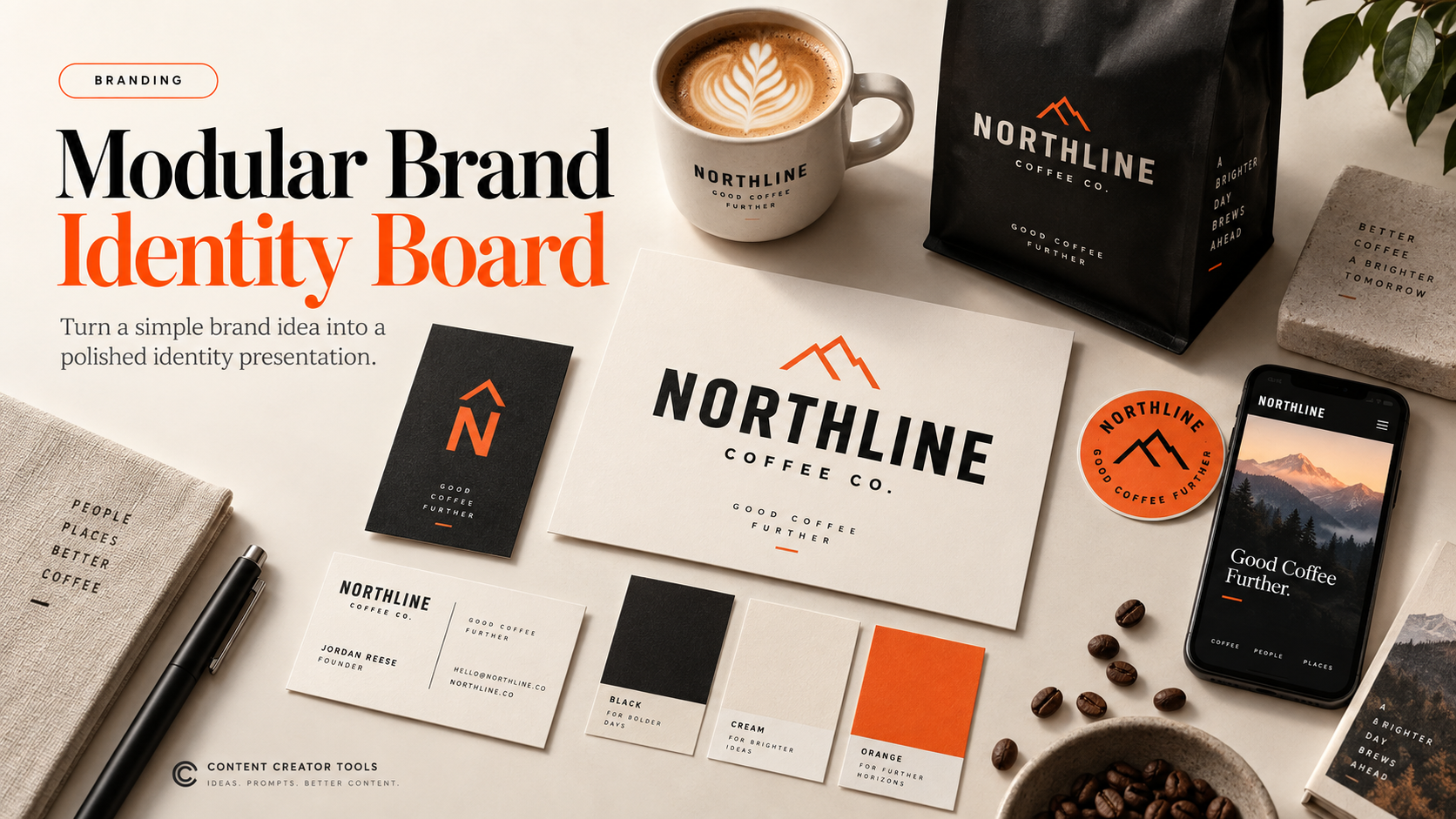
You’ll get a complete visual identity presented like a creative-agency case study. Instead of generating a lonely logo on a blank background, the image shows how the identity behaves across typography, color, stationery, packaging, merchandise, and digital applications.
The goal isn’t to treat the generated image as production-ready brand guidelines. It’s a visual direction board that helps you see whether a branding concept has enough personality and consistency to become a larger identity system.
How to Use It
Replace [BRAND NAME] and [TYPE OF BUSINESS] first. Then give the brand three to five personality words such as bold, optimistic, youthful, geometric, and playful.
Choose your colors deliberately rather than asking the model to invent everything. Finally, change [BACKGROUND MATERIAL / COLOR] to control the presentation style: warm paper, concrete, brushed steel, black acrylic, natural wood, or another surface that makes sense for the brand.
Generate the complete board first. Once you find a direction worth developing, create separate generations for the logo, packaging, stationery, signage, and digital applications instead of relying on details extracted from the overview image.
Make It Your Own
Luxury Identity
Use restrained serif typography, blind embossing, thick uncoated paper, black packaging, metallic foil, and warm directional light.
Playful Consumer Brand
Introduce chunky typography, unexpected color combinations, stickers, illustrated symbols, colorful packaging, and energetic compositions.
Tech Startup
Use a geometric symbol system, restrained sans-serif typography, dark UI screens, translucent materials, and subtle luminous accents.
Eco Brand
Build the identity around recycled paper, natural fibers, kraft packaging, muted botanical colors, minimal ink coverage, and tactile imperfections.
Retro Revival
Combine period-inspired typography and packaging structures with contemporary spacing and photography so it feels influenced by an era rather than copied from it.
Tips for Better Results
Keep the fictional brand name short. AI image models have improved with text, but asking them to reproduce long names across ten separate objects is still an excellent way to invite chaos to the brand meeting.
Define the brand personality before the aesthetic. Words like “minimal” and “modern” are too broad on their own; combinations such as technical, precise, energetic, and youthful give the model a clearer creative target.
Limit the palette. Three intentional colors plus a neutral generally produce a more convincing identity than asking for something colorful.
Make the branded objects relevant to the business. A restaurant might need menus and takeaway packaging; a skincare company needs bottles and cartons; a software company benefits more from screens, cards, event materials, and digital applications.
Use the overview as art direction, not a final brand guide. Once the system looks promising, regenerate individual assets at larger sizes and recreate important typography and logos manually for production.