
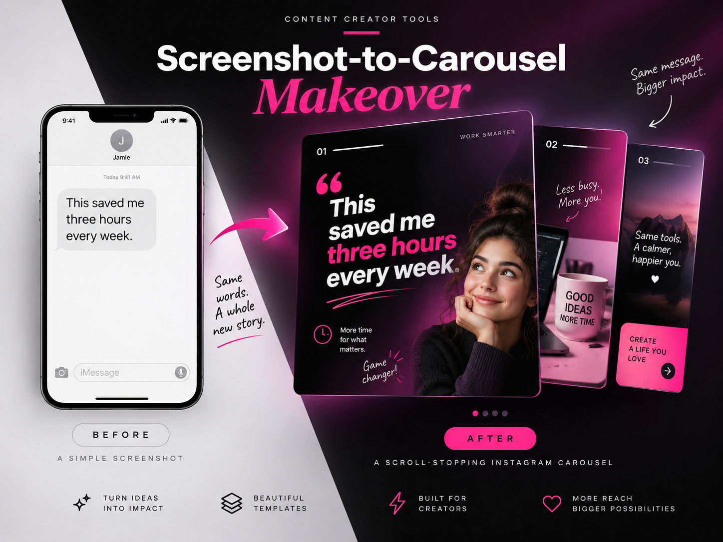
Some of your best social content is probably already sitting inside your phone.
A client testimonial, a great comment, a DM, an interesting stat, or even a simple sentence can become a strong carousel when the information is reorganized visually. This prompt takes a plain screenshot and turns it into a polished social post while keeping the original message intact.
Screenshot-to-Carousel Makeover Prompt
Use the uploaded screenshot as the exact content reference. Transform the information inside the screenshot into a polished Instagram carousel designed for clarity, engagement, and mobile readability. The screenshot may contain: – A testimonial – Review – Direct message – Comment – Quote – Short story – Statistic – Customer feedback – Social media post – Note – Short paragraph CONTENT PRESERVATION: Read the screenshot carefully. Preserve all important facts, claims, numbers, names, quotes, and meaning. Do not invent new information. Do not exaggerate the original message. If the screenshot contains a direct quote, preserve the wording accurately unless the user specifically asks for editing. Identify the most compelling sentence, phrase, result, or statistic from the screenshot. Use that as the main hook. CAROUSEL STRUCTURE: Turn the source content into approximately: [NUMBER OF SLIDES] Recommended range: 3 to 5 slides. Create a simple narrative flow. Example: SLIDE 1: Strong hook or strongest result. SLIDE 2: Original quote, testimonial, or important context. SLIDE 3: Supporting idea, takeaway, or explanation based only on the source content. SLIDE 4: Optional supporting detail or key lesson. FINAL SLIDE: Clear call to action. Do not stretch thin content across unnecessary slides. If the screenshot only contains enough information for three slides, create three strong slides instead of five weak ones. SLIDE 1 — HOOK: Create a short, highly readable headline based on the strongest part of the source material. The hook should immediately communicate why someone should swipe. Prioritize: – Clear results – Strong opinions – Surprising statements – Useful outcomes – Specific numbers – Emotional statements – Transformation Keep the hook concise. Avoid clickbait that misrepresents the original screenshot. CONTENT HIERARCHY: Create strong visual hierarchy on every slide. Each slide should contain: 1. One dominant idea 2. One clear headline or focal statement 3. Supporting information only when necessary Avoid placing equal visual weight on every sentence. Break longer text into readable sections. Use emphasis selectively on important words, numbers, or phrases. BRAND SYSTEM: Use the following visual identity: Primary color: [PRIMARY COLOR] Secondary color: [SECONDARY COLOR] Accent color: [ACCENT COLOR] Background style: [LIGHT / DARK / MIXED] Typography style: [MODERN / EDITORIAL / BOLD / MINIMAL / PLAYFUL] Brand mood: [PREMIUM / ENERGETIC / FRIENDLY / BOLD / CLEAN / ETC.] Maintain a consistent visual system across every slide. The slides should clearly belong to the same carousel while still having varied compositions. LAYOUT: Design specifically for an Instagram carousel. Use: – Large mobile-readable typography – Strong margins – Clear spacing – Intentional negative space – Simple visual hierarchy – High contrast – Balanced alignment Avoid overly small text. Do not make the carousel look like a presentation deck. Vary slide compositions naturally. For example: – Large headline slide – Quote card – Split layout – Number-focused slide – Image-led slide – Minimal text slide Do not use exactly the same layout on every slide. SOURCE SCREENSHOT: The original screenshot may appear as a supporting visual element where useful. Possible treatments: – Phone mockup – Cropped message bubble – Framed screenshot – Small proof element – Highlighted quote – Before-and-after comparison Do not rely on the screenshot itself as the entire design. Transform the information rather than simply decorating the screenshot. VISUAL ELEMENTS: Introduce a restrained set of supporting elements where appropriate: – Simple shapes – Arrows – Underlines – Highlight marks – Quotation marks – Icons – Small labels – Number markers – Photo crops – Subtle textures – Brand patterns Keep these secondary to the message. Avoid random decoration. TYPOGRAPHY: Use typography as the main storytelling tool. Prioritize readability on a phone screen. Keep headlines large. Use no more than approximately 2 to 3 type styles. Create visual contrast using: – Size – Weight – Case – Alignment – Color Do not fill slides with tiny paragraphs. If source text is long, extract the most important sentence for the slide and move secondary information to another slide. IMAGERY: If the carousel benefits from imagery, use: [IMAGE DIRECTION] Examples: – Lifestyle photography – Product photography – Portrait – Abstract brand image – Simple graphic illustration – No imagery Images should support the original message rather than distract from it. CALL TO ACTION: Use the final slide to clearly tell the viewer what to do next. CTA: [CALL TO ACTION] Examples: – Save this post – Follow for more – Comment your experience – Visit the link in bio – Read the full article – Send this to someone who needs it Keep the CTA simple. STYLE: Modern social media design. Mobile-first. High visual clarity. Strong typography. Professional art direction. Cohesive branding. Designed to encourage swiping, saving, and sharing. IMPORTANT: – Preserve the meaning of the uploaded screenshot. – Do not invent facts or testimonials. – Do not alter important numbers or results. – Do not create fake quotes. – Do not overcrowd slides. – Do not use tiny text. – Do not repeat the same layout on every slide. – Do not make it look like a generic Canva template. – Do not add unnecessary decorative elements. – Keep the carousel visually cohesive. – Prioritize readability over decoration. – Every slide should communicate one clear idea. OPTIONAL CREATIVE DIRECTION: Number of slides: [3 / 4 / 5] Primary color: [COLOR] Secondary color: [COLOR] Accent color: [COLOR] Background: [LIGHT / DARK / MIXED] Typography: [MODERN / EDITORIAL / BOLD / MINIMAL / PLAYFUL] Brand mood: [PREMIUM / ENERGETIC / FRIENDLY / BOLD / CLEAN] Image direction: [NONE / PORTRAIT / PRODUCT / LIFESTYLE / ABSTRACT] CTA: [YOUR CTA] Aspect ratio: [4:5]
What This Prompt Creates
This prompt turns a piece of raw social proof or information into an actual piece of social content.
Instead of simply dropping a screenshot onto a colored background, the AI identifies the strongest part of the message, creates a hook, reorganizes the information across several slides, and gives each slide a deliberate visual role.
The result can work especially well for testimonials, reviews, customer wins, comments, founder quotes, community feedback, statistics, short case studies, and educational content.
How to Use It
Upload a screenshot containing the content you want to transform.
The screenshot can be visually ugly. That is actually the point.
A plain message like:
“This saved me three hours every week.”
could become:
Slide 1:
THIS SAVED ME
3 HOURS A WEEK
Slide 2:
The original testimonial shown as social proof.
Slide 3:
A short supporting takeaway based only on the source.
Slide 4:
Your CTA.
Then customize the visual direction.
For example:
Number of slides: 4
Primary color: Black
Secondary color: White
Accent color: Hot pink
Background: Dark
Typography: Bold editorial
Brand mood: Energetic / premium
Image direction: Lifestyle
CTA: Save this post
Aspect ratio: 4:5
Make It Your Own
Client Testimonial Carousel
Turn a customer review into a hook-led carousel with the strongest result on Slide 1 and the original quote preserved on Slide 2.
Comment-to-Content
Take a thoughtful Instagram or LinkedIn comment and expand it into a short educational carousel while staying within the ideas already expressed in the comment.
DM Success Story
Use a client or community DM as the proof element, then organize the result, context, and takeaway into a short story.
Statistic Carousel
Upload a screenshot containing a key statistic and make the number the visual hero, supported by only the most important context.
Quote-to-Branded Post
Take one strong quote and turn it into a visually varied 3-slide series instead of posting a single quote card.
Tips for Better Results
Choose screenshots with one clear idea. If the screenshot contains seven unrelated topics, the AI has to decide what the post is actually about.
If the output feels too much like a PowerPoint presentation, add:
“Reduce presentation-style layouts. Use more editorial composition, larger typography, stronger image cropping, and less boxed content.”
If it becomes too decorative, add:
“Remove approximately 40% of the supporting graphic elements. Let typography and negative space carry the design.”
If the AI rewrites a testimonial too aggressively, reinforce:
“Preserve all direct testimonial wording exactly. Only reorganize the presentation, not the quote itself.”
And if there simply is not enough content for five slides, do not force five slides. A tight three-slide carousel will usually perform better than two slides of content and three slides desperately searching for a reason to exist.
Why This Works for Social Media
Screenshots already carry something polished marketing copy sometimes lacks: authenticity.
They look like real reactions, real conversations, and real outcomes.
The problem is that raw screenshots are rarely designed for readability or attention. By preserving the original proof while rebuilding the presentation, you get the trust of the screenshot and the clarity of professional social design.
Final Thought
Not every social post needs to start with a blank canvas.
Sometimes the content is already there.
It is just hiding in your screenshots.