
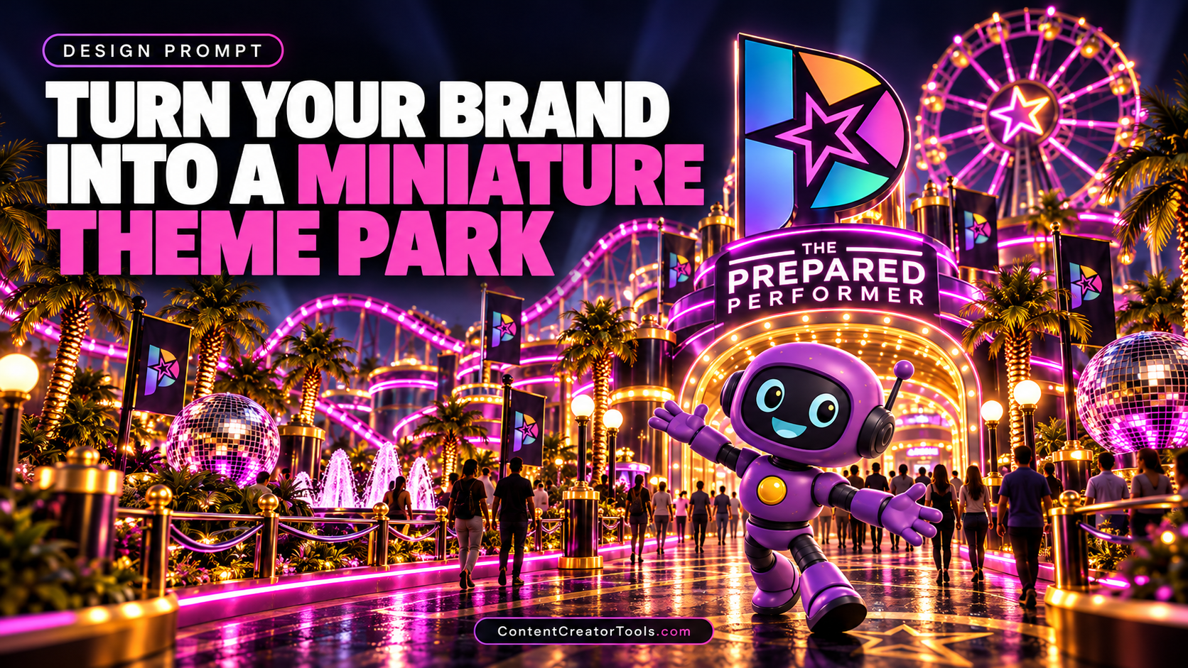
A good brand identity should feel bigger than a logo. It should suggest a world: colors, shapes, materials, personality, movement, and experiences that all belong together.
This prompt pushes that idea to an extreme by turning a brand system into a miniature theme park. Instead of simply placing the logo on signs, it asks AI to use the identity as the architectural DNA for an entire destination.
Turn Your Brand Into a Miniature Theme Park
Using the uploaded brand identity, logo, packaging, colors, typography, and product references as the visual source, transform the brand into an original miniature theme park. The goal is not to paste logos onto a generic amusement park. Translate the brand’s visual system into the actual architecture, attractions, landscape, materials, signage, and environmental design of the park. Create one large landmark structure inspired by the brand’s primary logo shape. It should feel architecturally believable and function as the visual anchor of the entire scene. Transform the brand’s packaging, products, icons, patterns, and signature shapes into attractions and buildings. Examples might include a product-shaped observation tower, packaging-inspired shops, color-blocked pavilions, sculptural fountains based on brand symbols, and ride vehicles derived from recognizable product forms. Carry the brand color palette throughout the environment in a disciplined way. Use it in pathways, awnings, flags, uniforms, landscaping accents, benches, parasols, railings, signage, ticket booths, and small props without turning the entire scene into one flat color wash. Use the brand’s typography style for wayfinding and attraction signage, but keep text minimal and legible. Do not invent unnecessary slogans or alter an uploaded logo. Populate the park with tiny visitors interacting naturally with the environment: walking, taking photos, waiting in lines, shopping, riding attractions, sitting at cafés, and exploring the brand world. Build strong visual hierarchy. The main logo-inspired landmark should be immediately recognizable, while secondary attractions reveal smaller brand references as the viewer looks around the image. Camera and composition: high three-quarter isometric view, approximately 35–50mm equivalent perspective with a subtle tilt-shift miniature effect, large enough field of view to show the entire brand world while maintaining readable detail. Lighting: warm late-afternoon or bright premium commercial daylight with realistic shadows, dimensional materials, polished surfaces, and strong separation between structures. Materials: believable physical construction such as painted metal, glass, concrete, fabric, plastic, wood, signage vinyl, water, foliage, and miniature architectural finishes. Style: premium miniature architectural photography, sophisticated brand-world design, realistic model-making detail, high-end advertising art direction, playful but not childish, clean and visually organized. Avoid copying any real theme park, attraction, branded entertainment property, or recognizable copyrighted environment. Create a completely original destination derived only from the supplied brand assets. The final image should look like a design agency built an elaborate physical scale model showing what the brand would become if customers could literally walk inside its identity.
What This Prompt Creates
This prompt creates a detailed miniature environment in which every major design decision comes from one brand identity. Logos can become landmarks, packaging can become buildings, signature shapes can become attractions, and brand colors can define the landscape.
The result works as a branding concept piece, campaign visual, pitch-deck image, portfolio project, product-launch teaser, experiential-marketing concept, or social post showing how far a visual identity can stretch.
The strongest results feel cohesive before they feel branded. Even without zooming in on a logo, the palette, forms, materials, and repeated motifs should make the entire park feel like one system.
How to Use It
Upload the clearest brand assets you have: primary logo, color palette, packaging, product photography, icons, patterns, and a sample of the typography. The more consistent the references are, the easier it is for the model to build one coherent world.
If you’re working with a fictional brand, describe the business and personality in one sentence before the main prompt. For example: “A playful premium sparkling-water brand built around citrus colors, rounded typography, and translucent cans.”
Choose one element to become the park’s landmark. This is usually the logo, hero product, or most recognizable package shape. Let everything else support that anchor rather than competing with it.
Make It Your Own
Beauty Brand Resort
Turn perfume bottles, compacts, jars, and cosmetic packaging into elegant pavilions, fountains, spas, and sculptural attractions with polished luxury landscaping.
Food & Beverage Festival Park
Use cans, bottles, cups, wrappers, and ingredients as colorful architecture, food stalls, rides, and oversized environmental details.
Tech Innovation Park
Translate devices, interface shapes, circuit patterns, and product materials into sleek pavilions, kinetic attractions, light installations, and futuristic public spaces.
Fashion Brand Playground
Turn garment details, tags, patterns, stitching, accessories, and retail fixtures into sculptural buildings, runways, observation decks, and immersive installations.
Kids Brand Adventure World
Build a brighter, more playful environment using soft forms, colorful structures, oversized product elements, activity zones, and friendly original mascots without referencing an existing entertainment franchise.
Tips for Better Results
Give the model actual brand assets rather than describing the identity from memory. A logo plus packaging reference is far more useful than simply saying “make it on-brand.”
Ask the model to translate shapes instead of decorating with logos. A building whose silhouette comes from the logo is more interesting than a normal building with the logo stuck on the roof.
Limit the palette. Real brand environments become stronger when a few core colors repeat intentionally instead of every object becoming saturated.
Include tiny people. Human scale is what makes the miniature architecture feel enormous, believable, and worth exploring.
If the output becomes visually chaotic, reduce the number of attractions and ask for one landmark, three secondary zones, and consistent landscaping between them.
For campaign use, generate both a wide overview and a few ground-level close-ups from inside the same imaginary park. The concept becomes much more convincing when it feels like a place rather than a single image.